Report controls
Report controls are used to display various information in a report.
What is a report control?
A Report Control represents a specific report element (like text, image, checkbox, etc.) that can be inserted into a report. Report controls can be added either to report bands or to other report controls which may serve as control containers (like a panel).
To add a new control to the report, use either of the following options:
- Drag an item from the Toolbox pane to the report band.
- Use the Data Source window. When any data field is dragged to a report, a new appropriate report control is added and automatically bound to the specified data field.
Types of controls
The dbForge tool supports the following report controls:
- Label
- Check Box
- Rich Text
- Picture Box
- Panel
- Table
- Character Comb
- Line
- Shape
- Bar Code
- Chart
- Cross Tab
- Gauge
- Sparkline
- PDF Content
- Table of Contents
- Page Info
- Page Break
- Cross-band Line
- Cross-band Box
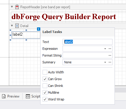
Label
 : Inserts a text into a report. This text may be either static or dynamically populated from a report’s data source.
You can double-click the control and modify the text in the in-place editor. In addition, you can use the smart tag menu to perform the following operations over the control:
- Change the text of the control.
- Bind the control to data from a report’s data source in the Expression field.
- Increase or decrease the control’s height by selecting or clearing the Can Grow and Can Shrink checkboxes.
- Format control data using the Format String editor.
- Calculate a group, report, or page summary using the Summary editor.
- Adjust the width of the control to its content by selecting the Auto Width checkbox.
- Enable the multiline text or word wrap.
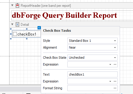
Check Box
 : Displays a True/False or Checked/Unchecked/Indeterminate state in a report.
You can double-click the control and modify the control caption in the in-place editor. In addition, you can use the smart tag menu to perform the following operations over the control:
- Change the appearance of the control by selecting the style from the Style drop-down list.
- Adjust the alignment of the checkbox.
- Specify the control’s state by selecting either Checked, Unchecked, or Indeterminate from the CheckBox State drop-down list.
- Bind the control to data from a report’s data source in the Expression field.
- Change the control caption in the Text field.
- Format control data using the Format String editor.
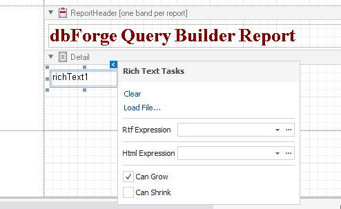
Rich Text
 : Allows you to display, enter and manipulate formatted text. You can enter and format its text at design time, load it from an external file, or bind this control to a data field.
You can double-click the control and modify the control caption in the in-place editor. In addition, you can use the smart tag menu to perform the following operations over the control:
- Load data from RTF (.rtf and.docx) or HTML (.html or .htm ) files.
- Bind the control to data from a report’s data source containing RTF or HTML content using the Rtf Expression and Html Expression fields/editors respectively.
- Increase or decrease the control’s height by selecting or clearing the Can Grow and Can Shrink checkboxes.
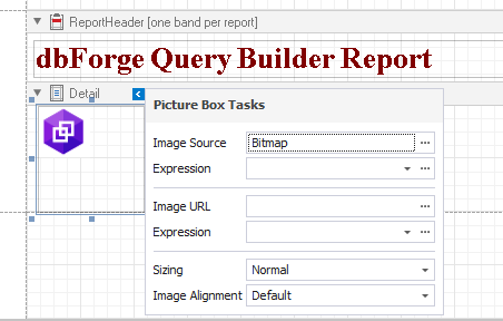
Picture Box
 : Allows you to display an image in a report. Use this control to insert images of different types into your reports.
You can use the smart tag menu to perform the following operations over the control:
- Load the image to the control in the Image Source field.
- Bind the control to data from a report’s data source in the Expression field.
- Specify the path to the image in the Image URL field.
- Adjust the size of the image in the Sizing field.
- Manage the alignment of the image.
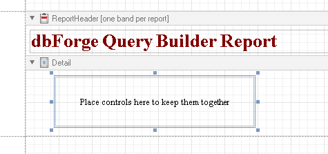
Panel
 : Displays a container for other report controls and can be used to group controls.
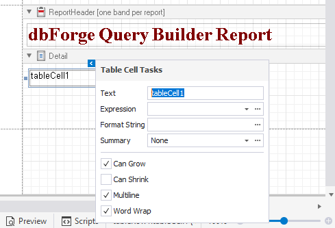
Table
 : Inserts a table (containing rows and cells) in a report.
Note
To create a table that is identical to some table from data source, simply drag the needed table from the Data Source window onto Report Designer. Each cell of the table will be bound to a field of the source table.
You can double-click the control and modify the control text in the in-place editor. In addition, you can use the smart tag menu to perform the following operations over each cell separately:
- Change the text of the control.
- Bind the control to data from a report’s data source in the Expression field.
- Increase or decrease the control’s height by selecting or clearing the Can Grow and Can Shrink checkboxes.
- Format control data using the Format String editor.
- Calculate a group, report, or page summary using the Summary editor.
- Adjust the width of the control to its content by selecting the Auto Width checkbox.
- Enable the multiline text or word wrap.
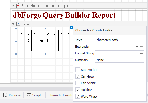
Character Comb
 : Displays the text so that each character is printed in an individual cell.
You can double-click the control and modify the control text in the in-place editor or use the smart tag menu to perform the following operations over the control:
- Change the text of the control.
- Bind the control to data from a report’s data source in the Expression field.
- Increase or decrease the control’s height by selecting or clearing the Can Grow and Can Shrink checkboxes.
- Format control data using the Format String editor.
- Calculate a group, report, or page summary using the Summary editor.
- Adjust the width of the control to its content by selecting the Auto Width checkbox.
- Enable the multiline text or word wrap.
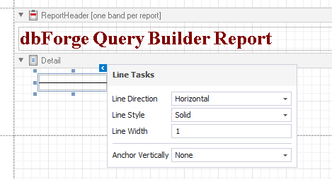
Line
 : Draws lines in a report.
You can use the smart tag menu to customize the appearance of the line such as draw horizontal, vertical, or diagonal lines, select solid, dashed, dotted, or mixed line style, specify the line width and vertical anchoring style.
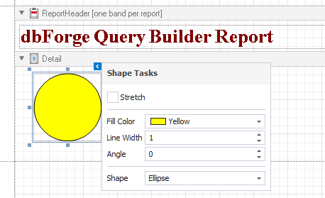
Shape
 : Inserts any simple graphics into a report.
You can use the smart tag menu to customize the appearance of a graphic element:
- Select the Stretch checkbox to allow stretching the shape in case its size changes.
- Specify the background color.
- Set the outline width.
- Specify the angle by which the graphic element is rotated.
- Select the shape of the graphic element.
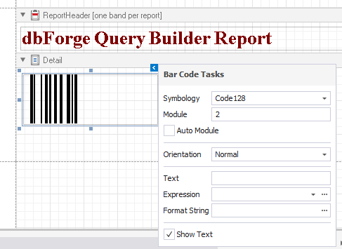
Bar Code
 : Inserts many different barcode types into a report.
You can use the smart tag menu to set barcode properties:
- Select a barcode type from the Symbology drop-down list.
- Set a fixed barcode width in the Module field.
- Select the Auto Module checkbox to automatically set a barcode width.
- Specify the barcode orientation.
- Add the barcode text.
- Bind the control to data from a report’s data source in the Expression field.
- Format control data using the Format String editor.
- Select the Show Text checkbox to display the barcode text.
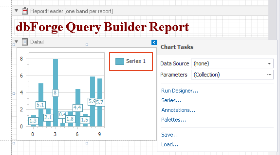
Chart
 : Represents data in a graphical view.
Note
If the Chart control is bound to data, set the Data Source option in the report smart tag to (none) to display it correctly.
When you drag the Chart control to the band, Chart Designer opens where you can add a chart and customize its settings.
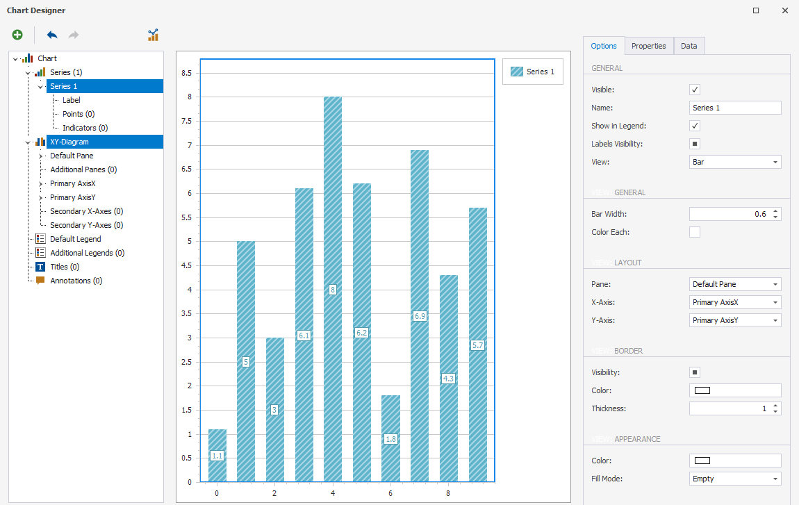
After the chart is added, you can use the smart tag menu to perform the following operations over the control:
- Bind the chart to data in the Data Source field.
- Open Chart Designer to modify the chart settings. To do so, click Run Designer.
- Customize a series by clicking Series.
- Add annotation and set its options by clicking Annotations.
- Customize the palettes by clicking Palettes.
- Export the chart to an .xml file.
- Load the chart as an .xml file.
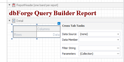
Cross Tab
 : Represents data from an underlying data source in a cross-tabulated form to create cross-tab reports.
Note
If the Cross Tab control is bound to data, set the Data Source option in the report smart tag to (none) to display it correctly.
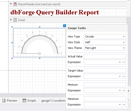
Gauge
 : Insert a gauge into the report.
You can use the smart tag menu to customize the gauge:
- Specify a view type: linear or circular.
- Specify a view style: horizontal or vertical for a linear gauge, and full, half, quarter left, quarter right, or three fourth for a circular gauge.
- Specify a view theme: flat light or flat dark.
- Set the actual and target values to be displayed by the gauge.
- Bind values to data source in the corresponding Expression fields.
- Set the maximum and minimum values for the gauge.
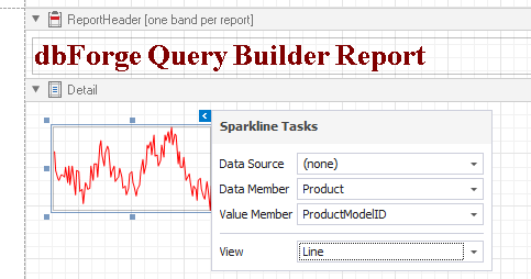
Sparkline
 : Displays a sparkline chart in a report.
You can use the smart tag menu to perform the following operations over the sparkline:
- Bind the control to data.
- Specify the name of the data member assigned to the sparkline.
- Select the data field from which the values will be used.
- Customize the sparkline view: line, area, bar, or winloss.
PDF Content
 : Inserts a .pdf file.
You can use the smart tag menu to perform the following operations over the control:
- Import the .pdf file.
- Bind the control to data from a report’s data source in the Expression field.
- Specify a path to the .pdf file.
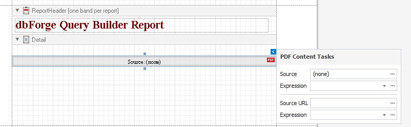
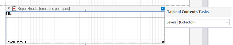
Table of Contents
 : Generates a table of contents.
To add a Table of Contents control, drag the item from the Toolbox pane to the ReportHeader band. You can use the smart tag menu to add a new level to the table of contents.
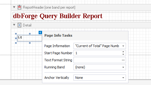
Page Info
 : Displays additional information on report pages, such as current date and time, page numbers, or username.
You can use the smart tag menu to perform the following operations over the control:
- Insert additional information such as the page number, total number of pages, current date and time, username, and page count.
- Specify a start page number.
- Format control data using the Format String editor.
- Set page numbers for the group, if it exists, in the Running Band field.
- Specify a type of vertical anchoring for the control.
Page Break
 : Creates a page break below which report content will be displayed on a new page.
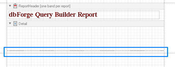
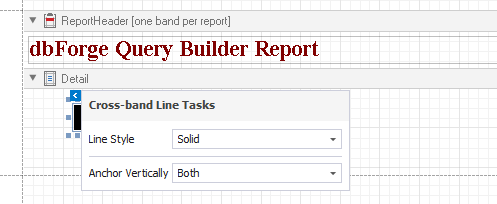
Cross-band Line
 : Draws a vertical line to be displayed across several bands, from the CrossBandControl.StartPoint to the CrossBandControl.EndPoint.
You can use the smart tag menu to customize the style of the control and specify a type of vertical anchoring.
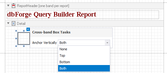
Cross-band Box
 : Draws a box to be displayed across several bands, from the CrossBandControl.StartPoint to the CrossBandControl.EndPoint.
You can use the smart tag menu to specify a type of vertical anchoring of the control.