How to create a chart report
A chart report is a type of report that visually presents data using graphs, charts, or other visual elements. Chart reports are used to present complex information in a more easily digestible format, allowing users to quickly identify trends, patterns, and insights in the data. Examples of chart reports include bar charts, pie charts, line charts, scatter plots, and more. Chart reports are commonly used in business, finance, healthcare, and many other industries to analyze and communicate data clearly and concisely.
In this topic, we will look at how to create a chart report using the dbForge Query Builder.
Prerequisites
We’ll use the following SELECT statement as the data set for the example. The sample database is AdventureWorks2022.
SELECT
 soh.OrderDate,
 p.Name AS ProductName,
 SUM(sod.LineTotal) AS TotalSales
FROM
 Sales.SalesOrderHeader soh
INNER JOIN
 Sales.SalesOrderDetail sod ON soh.SalesOrderID = sod.SalesOrderID
INNER JOIN
 Production.Product p ON sod.ProductID = p.ProductID
WHERE
 soh.OrderDate BETWEEN '2014-01-01' AND '2014-01-06'
 AND p.Name IN ('Road Bottle Cage','Touring Tire Tube','Short-Sleeve Classic Jersey, XL')
GROUP BY
 soh.OrderDate,
 p.Name
ORDER BY soh.OrderDate;
Create a chart report
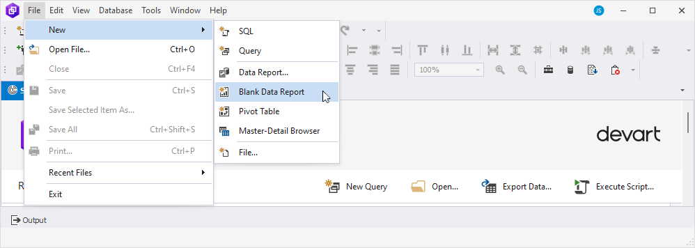
1. On the ribbon, select File > New > Blank Data Report to open the report template.
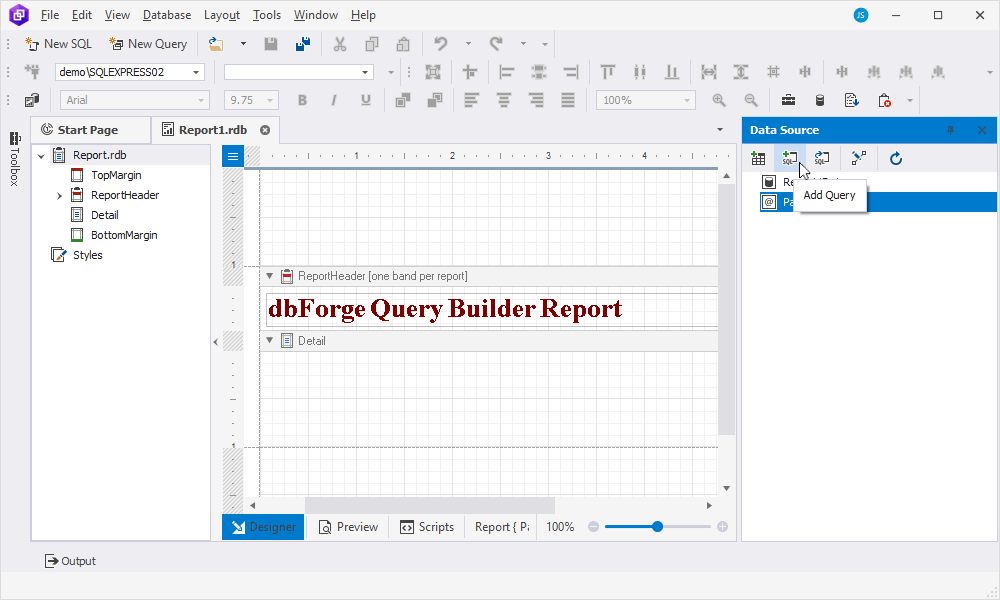
2. In the Data Source pane, click Add Query to insert the query based on which the data will be retrieved.
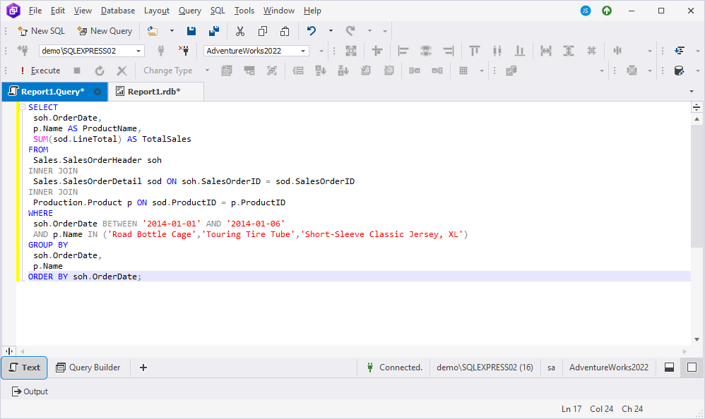
3. In the Report.Query document that opens, select the Text view at the bottom of the page and insert the query you want to use for generating the chart report.
4. Save the changes and close the query document.
5. Return to the report template. You can see that the query and its columns have appeared in the Data Source pane, which means that the report is now successfully bound to the data.
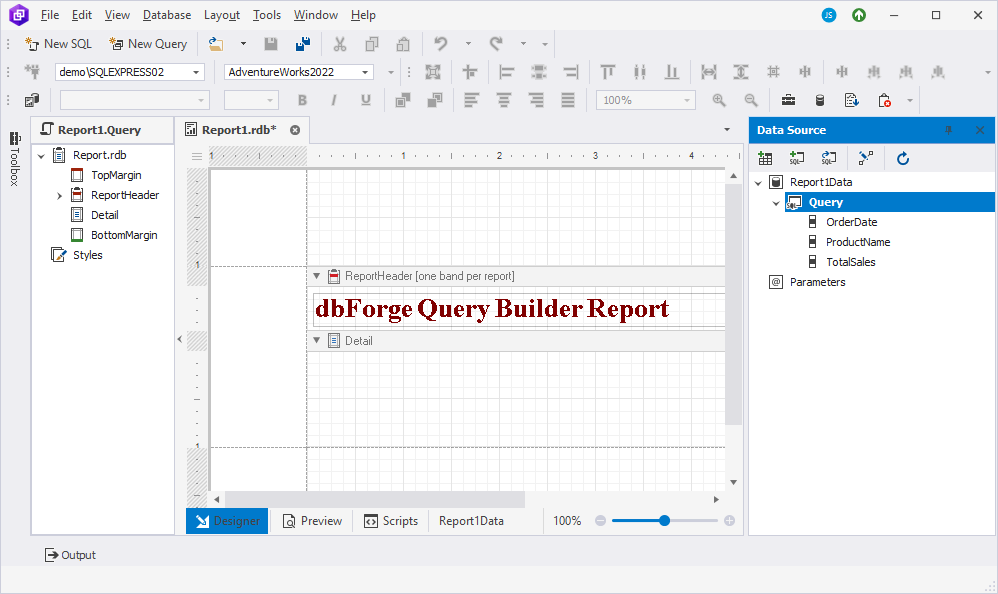
6. Select the ReportHeader band in the body of the report. Then, navigate to the Toolbox pane and drag the Chart control to the ReportHeader band.
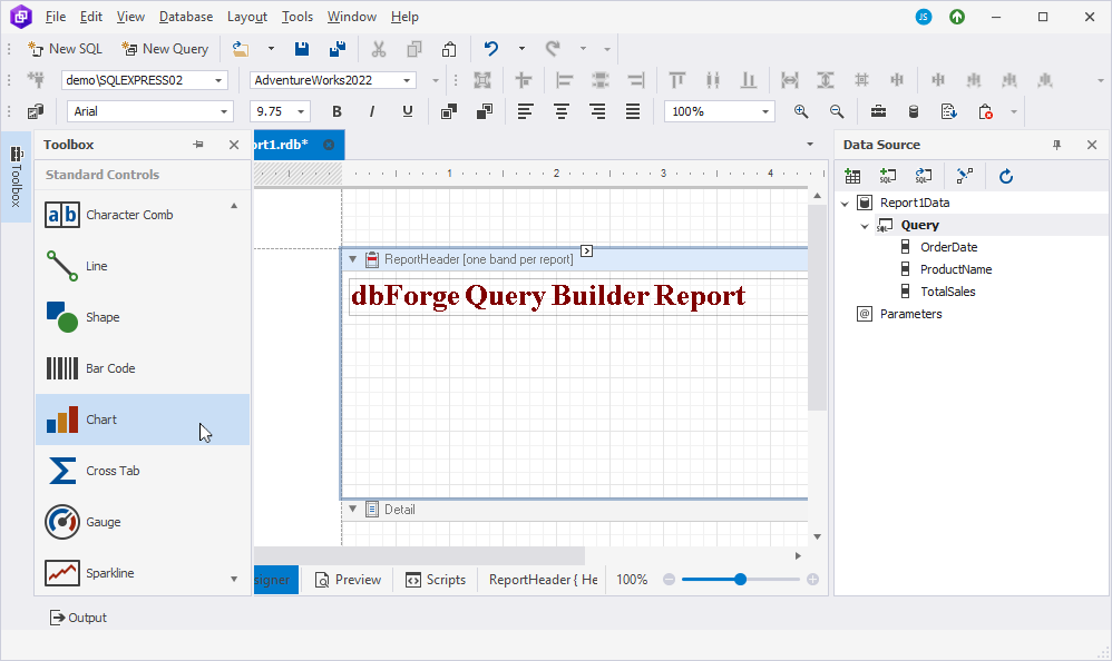
Note
To display the Toolbox pane, go to View -> Other Windows -> Toolbox.
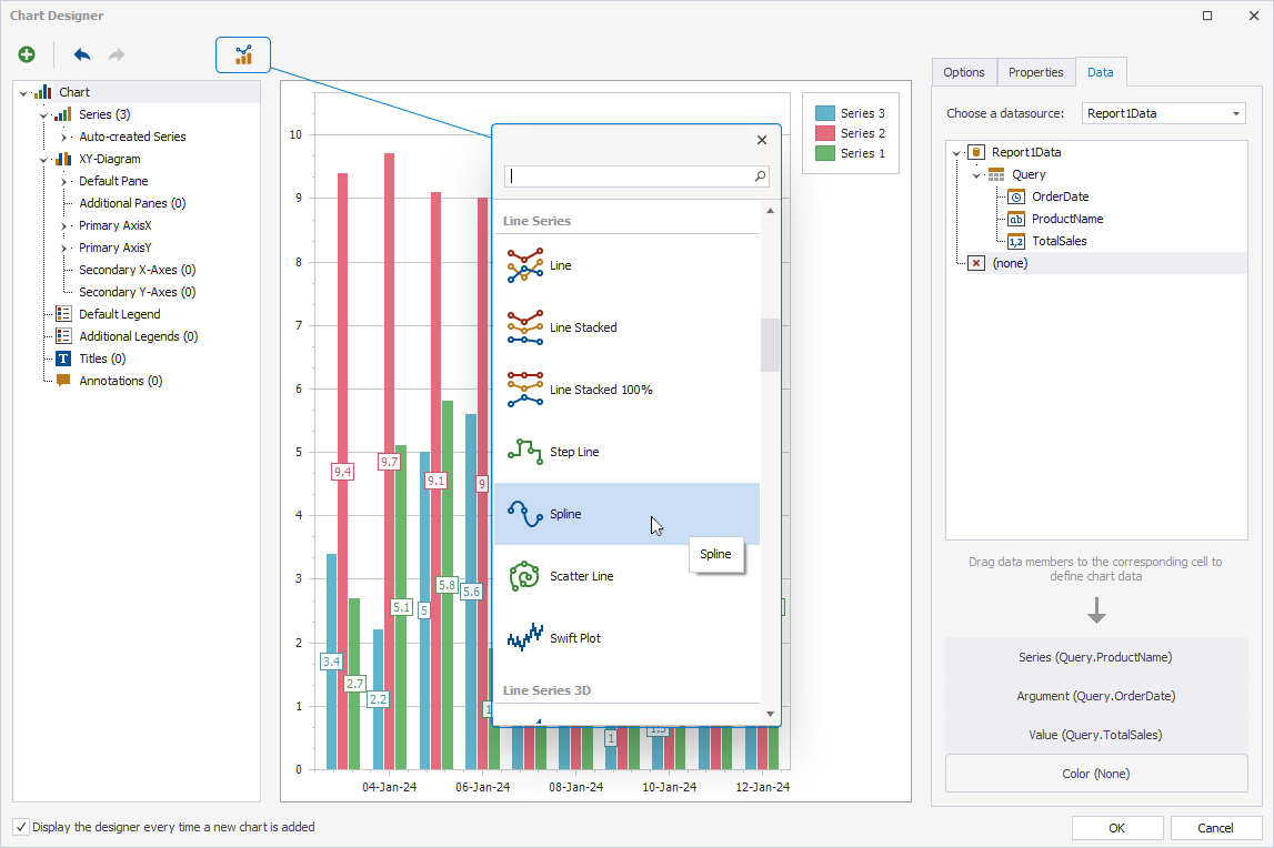
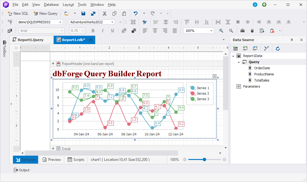
7. In the Chart Designer window that opens, specify the chart’s series, argument, and value. This can be done by assigning the appropriate columns to the respective fields. To do this, switch to the Data tab and expand the Query node. From there, drag the TotalSales column to the Value field, the OrderDate to the Argument field, and the ProductName to the Series field.
In our example, we select the sparkline chart type. To change the default type of the chart, click Change Chart Type and select the required type.
Once done, the result should be as follows.
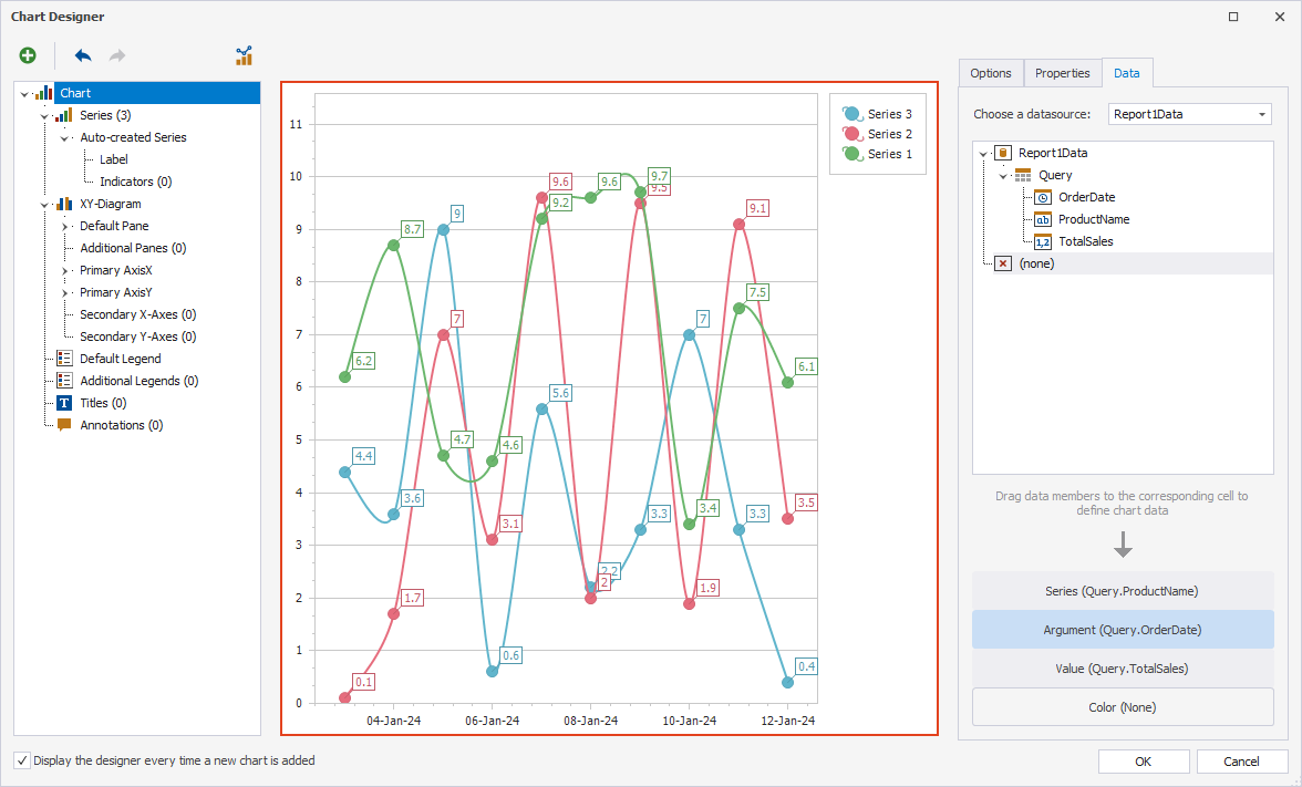
Click OK to save the changes. The Designer view displays the following chart:
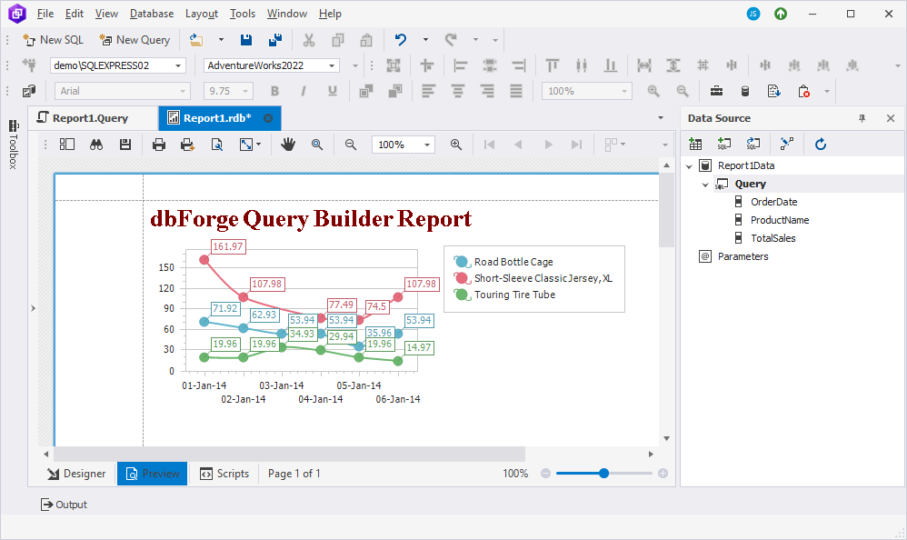
8. At the bottom of the page, switch to Preview to see the resulting chart.