How to create a chart report
A sparkline chart can be used to be included in a cell of a table, spreadsheet, or report to provide a quick and concise visualization of data. Unlike traditional charts, sparklines typically lack axes, labels, and other chart elements.
This type of report is effective for displaying multiple sparklines together to compare trends across different categories or time periods.
Prerequisites
For demonstration purposes, we will create a cross-tab report with a sparkline chart. This report will showcase data categorized by date across three different groups: Headcount, Realization - Adjusted, and Realization - Unadjusted. The sparkline chart will be presented for each category.
We have also created the db_sparkline database, which is a sample database for the trends table to be used for the report. In addition, the charts will be based on the following queries:
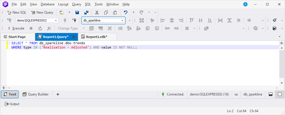
-- Query #1
SELECT * FROM db_sparkline.dbo.trends
WHERE type IN ('Realisation - Adjusted') AND value IS NOT NULL;

-- Query #2
SELECT * FROM db_sparkline.dbo.trends
WHERE type IN ('Realisation - Unadjusted') AND value IS NOT NULL;

-- Query #3
SELECT * FROM db_sparkline.dbo.trends
WHERE type IN ('Headcount') AND value IS NOT NULL;
Step 1: Create a cross-tab report
1. Navigate to the File menu and select New > Blank Data Report to open the report template.
2. Expand the ReportHeader band by moving its resize handles.
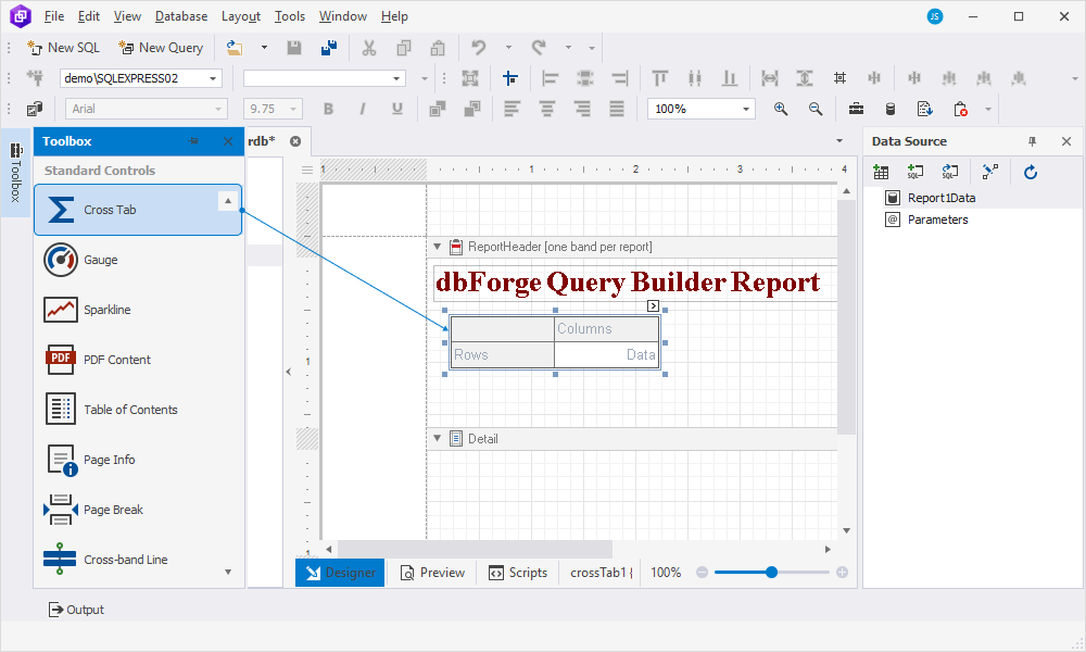
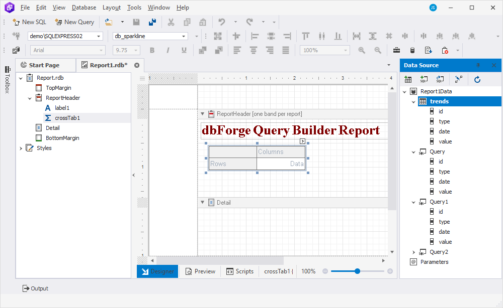
3. To add the cross-tab control, use the Toolbox pane, which provides controls for various types of information display. To open it, go to View > Other Windows > Toolbox.
From the Toolbox pane, drag the Cross Tab control to the ReportHeader band.
Note
Ensure the Cross Tab control is placed in the ReportHeader band. Inserting the control in the Detail band will cause the cross-tab data to be shown for each record in the report’s record source.
The Cross Tab control shows the following areas:
- Rows: Displays field values as row headers.
- Columns: Displays field values as column headers.
- Data: Calculates summaries of row and column fields.
4. Bind the report to the table and queries. The fields of the table will be used as rows, columns, and data of the report, while queries will be used for the sparkline charts.
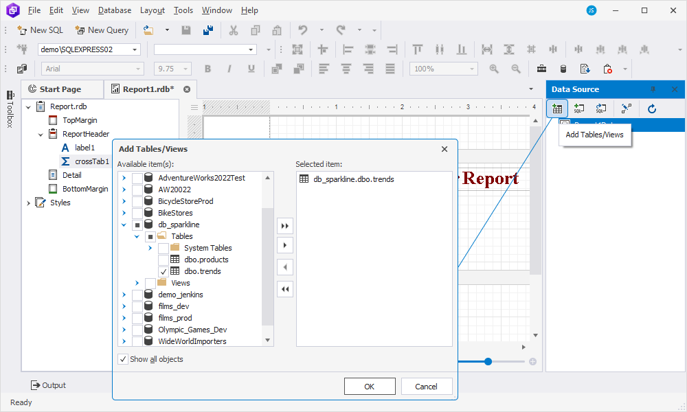
To bind the report to the table, on the Data Source toolbar, click ![]() Add Tables/Views. In the dialog that opens, select the table you want to add and click OK.
Add Tables/Views. In the dialog that opens, select the table you want to add and click OK.
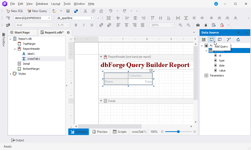
5. To bind the report to the queries, on the Data Source toolbar, click Add Query.
6. In the Report.Query document that opens, switch to the Text view at the bottom of the page, select the database to be used for report generation, insert the query you want to use for building the sparkline chart, and save the changes. Alternatively, when you close the unsaved query document, the tool will prompt you to save changes - click Yes to proceed.
Note
If you use several queries for a report as in our case, repeat steps 5 and 6 for each query.
The table and queries now appear in the Data Source pane, which means that the report is now successfully bound to the data.
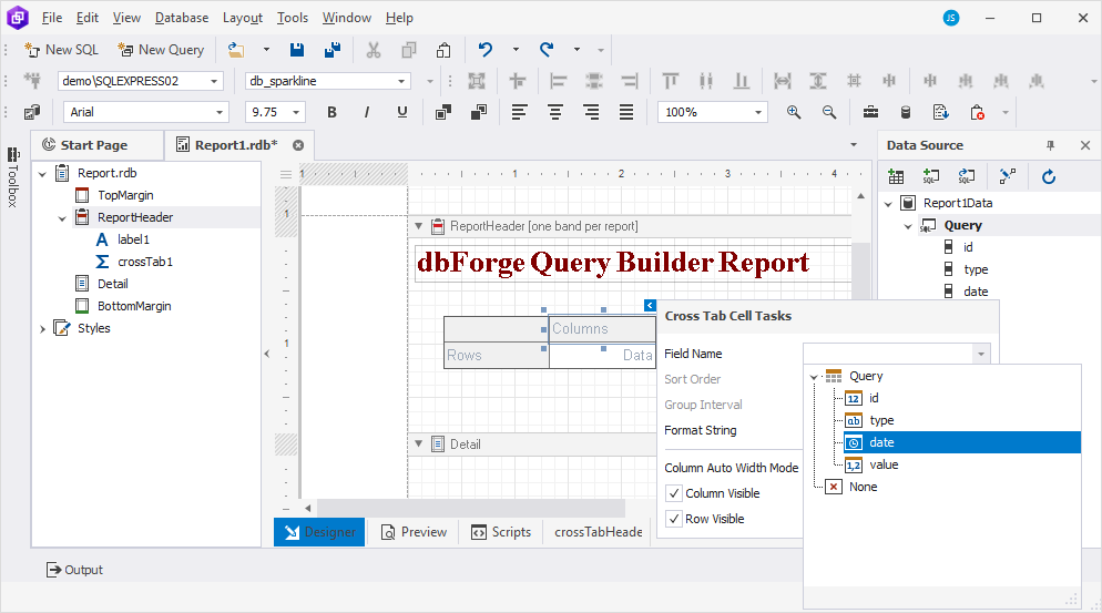
7. Under Data Source, drag the fields from the table to the corresponding cross-tab area on the ReportHeader band to define the layout and bind fields to data:
- Drag the type field onto the Rows cell to group the data by type.
- Drag the date field onto the Columns cell to display the data by date.
- Drag the value field onto the Data cell to display the data for each combination of type and date.
Note
If you have data sources configured, you can also bind fields to data using the Cross Tab Cell Tasks window. For more information, see the Bind fields to data using the Cross Tab Tasks window section in How to create a cross-tab report.
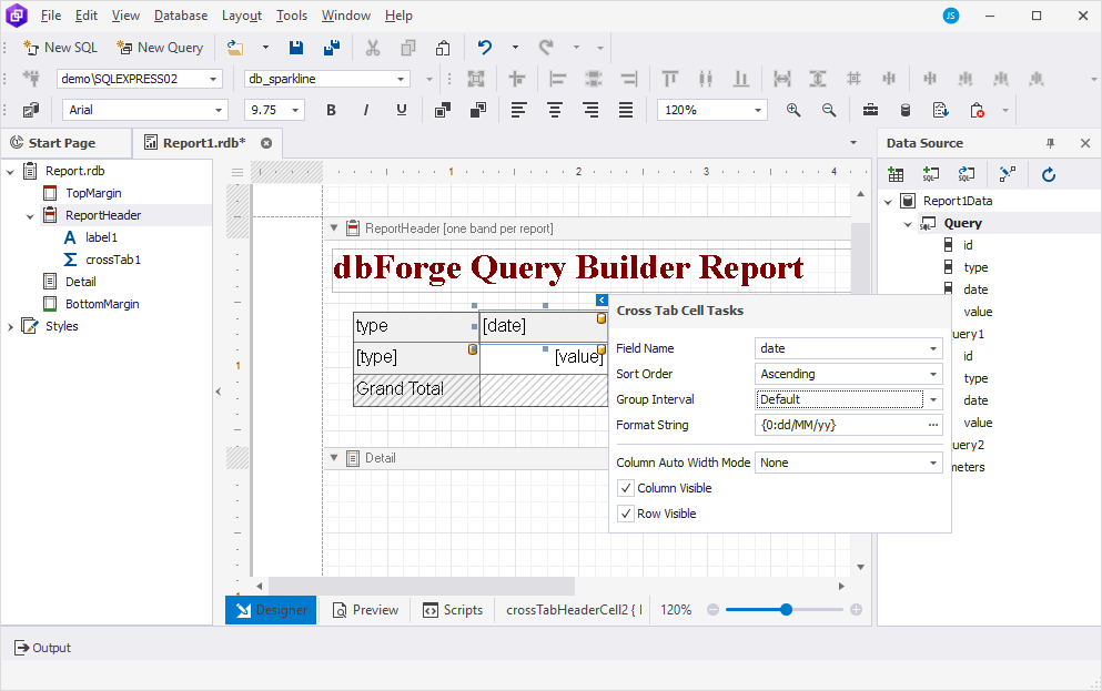
8. Now, change the format string of each cell in the Cross Tab Cell Tasks window:
-
For the date cell:
-
In the ReportHeader band, select the date cell and click
 Smart Tag to open the Cross Tab Cell Tasks window.
 -
In the Format String field, enter a custom format - {0:dd/MM/yy}. In addition, you can open the Format String Editor from the Format String field to set up formatting options.
-
-
For the value cell, in the Cross Tab Tasks window, specify a custom format string - {0:#.##} and click OK to save the changes.
-
The type cell remains unchanged.
9. The Cross Tab control calculates automatic totals and grand totals across the row and column fields. This report does not require this information, that’s why we’ll hide them as follows:
- Select the Grand Total column cell, click Smart Tag, and clear the Column Visible checkbox in the Cross Tab Cell Tasks window.
- Select the Grand Total row cell, click Smart Tag, and clear the Row Visible checkbox in the Cross Tab Cell Tasks window.
The layout is ready, and the fields are bound to data. So, it is time to insert a sparkline chart into the report.
Step 2: Insert a sparkline chart to the report
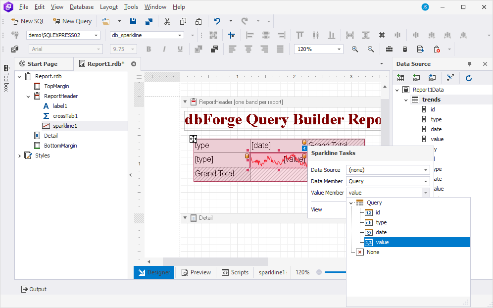
1. In the Cross Tab control, select the cell - value in our case - for which you want to create a sparkline chart.
2. From the Toolbox pane, drag the Sparkline control into the corresponding cell, adjusting its size to match the cell dimensions.
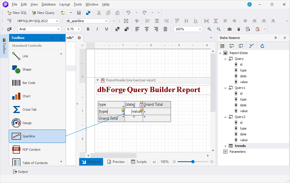
3. In the upper-right corner of the cell, click ![]() Smart Tag to open the Sparkline Tasks window and do the following:
Smart Tag to open the Sparkline Tasks window and do the following:
- Leave Data Source as is.
- From the Data Member dropdown list, select the query based on which the data will be retrieved.
- From the Value Member dropdown list, select the value that indicates the data to be displayed.
- Optional: You can select the appropriate visualization of the sparkline chart from the View dropdown list.
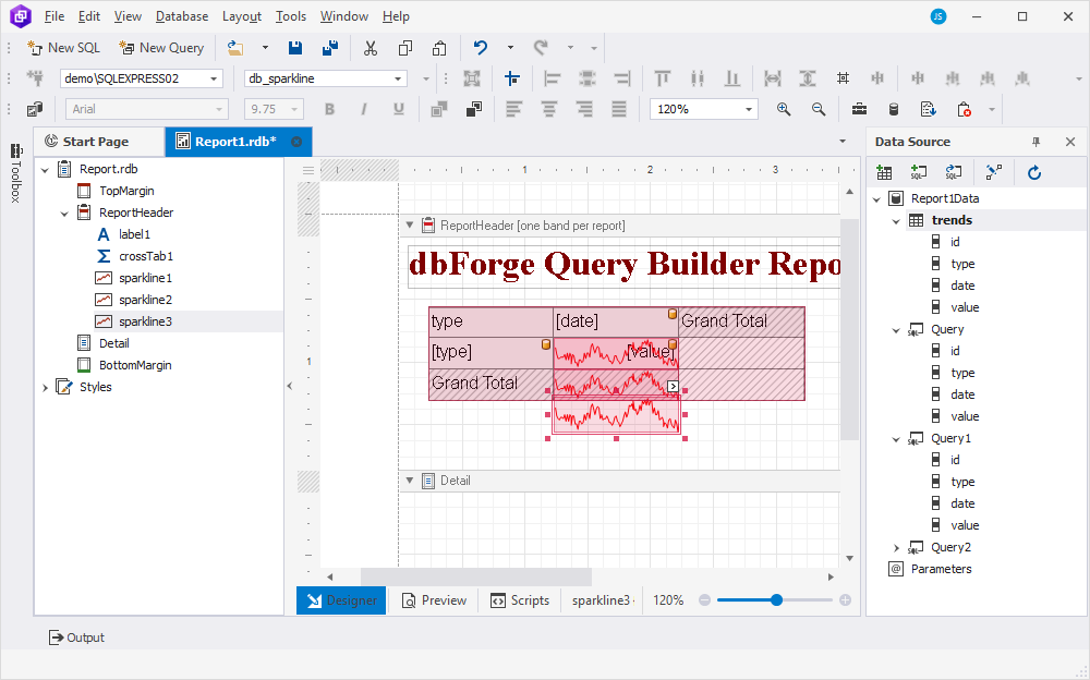
4. Repeat the same steps for all cells for which you want to create a sparkline chart. Each subsequent sparkline control should be placed below the previous one.
Note
In our example, we want to add sparkline charts for three types. The cross-tab control displays only two cells. In this case, when adding a sparkline chart from the third query, it will be added below the grid. To ensure proper display, move it up by 1px while holding the Ctrl key and pressing the Up Arrow key.
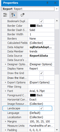
5. Change the report page layout to landscape to ensure the cross-tab content fits the report page. To do this, open the Properties pane by going to View and selecting Properties. Then, select Report from the upper dropdown list and select the Landscape checkbox.
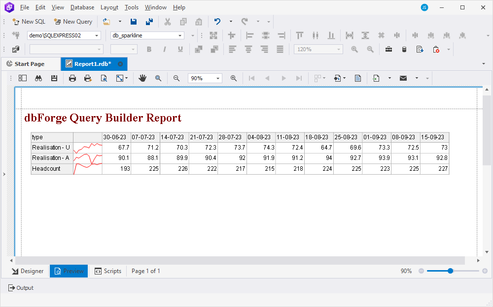
6. Once you’ve finished adding the sparkline charts to the report, select Preview at the bottom of the Report Designer to view the result.
Customize the appearance of a chart report
Here are some tips you can use to customize the appearance of your report.
Style the report bands and labels for table data
You can use the Properties pane to customize the appearance of bands and labels on the report such as such as landscape view, background color, font, text alignment, and other settings. To open it, select View > Properties.