How to create a chart from the pivot table
In dbForge Query Builder, you can view pivot data as a chart. Such an option helps visualize data dependencies and conveniently analyze them.
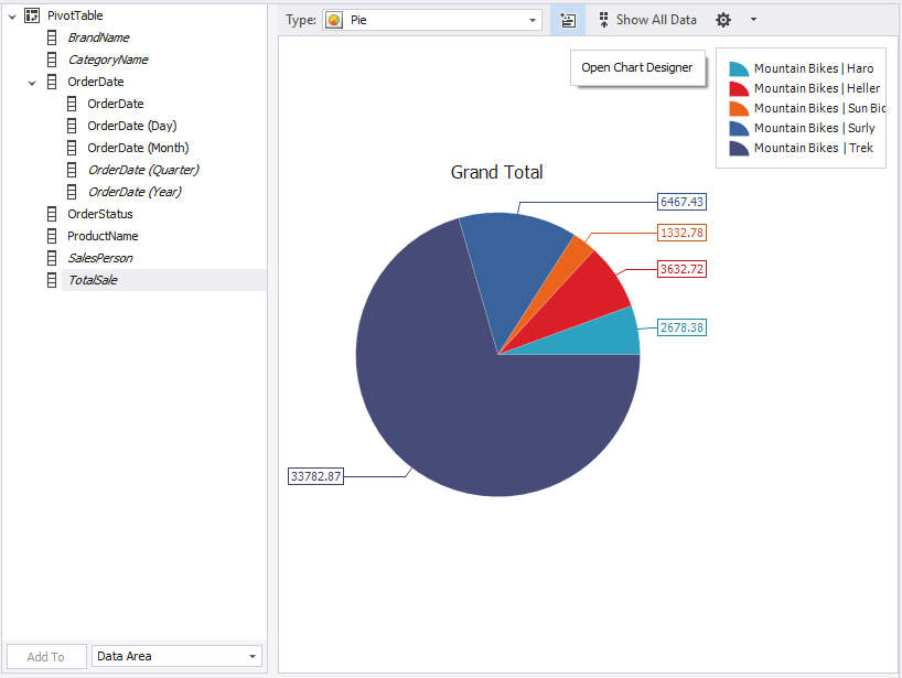
You can view a chart associated with the required pivot data directly in the pivot table document, in a special view.
Let’s build a chart based on the pivot table data created in Walkthrough on how to create a pivot table.
To view the pivot table data as a chart
1. On the Pivot Table toolbar, click Show Chart to open the Charts view of the pivot table document.
2. Select the data to be displayed on the chart on the Pivot Table view of the document by pressing CTRL and clicking the needed cells of the pivot table or by selecting the cells of the table with the left mouse button pressed.
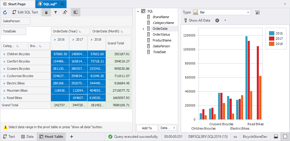
3. Adjust the chart options using the Chart view toolbar, shortcut menu, or Chart Designer.
Chart Wizard
Chart Wizard helps the user create and adjust a chart quickly and easily by guiding them step-by-step through the process of visualizing pivot data. It consists of 13 pages that provide a set of chart design, layout and formatting options.
To open Chart Wizard, click Open Chart Designer on the toolbar of the chart window.
Let’s have a detailed look at the settings Chart Wizard provide.
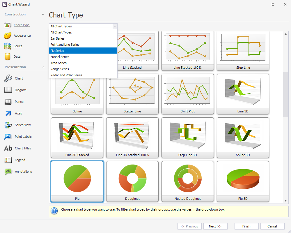
On the Chart Type page, you can select the type of the chart you want to create. Currently, there are 56 chart types available. Select a chart type that works best for your data and click Next. To filter chart types by groups, use the drop-down list.
On the Appearance page, you can select colors for data visualization. There are 49 in-built palettes to choose from, however, you can create your own one, if required.
To create a new palette, click Edit palettes in the Palette drop-down. In the Palettes dialog that opens, click New and enter the name for a new palette. Click Add to add colors to the palette, then double-click the color to edit. In the Color dialog that opens, select the color and click OK. Repeat this for every color in the palette. When finished, click OK to close the Palettes dialog.
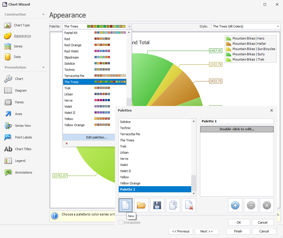
Next, in the Style drop-down, select the style for the chosen palette. Click Next to proceed to the next page of the Chart Wizard.
On the Series page, you can add an additional data series to the chart and adjust its properties. Click Next.
On the Points tab of the Data page, you can manually enter data points. On the Series Binding tab, you can choose a data source and configure data binding options. On the Auto-created Series tab, you can configure automatically created series. On the Pivot Grid Datasource tab, you can customize various settings that determine a linked Chart and the common behavior of the pivot grid.
Having configured the settings from the Construction group, you can proceed to the Presentation settings.
On the Chart page, you can customize the chart representation properties such as background color, fill style, chart borders and padding. You can also add a text and a background image, if required.
On the Diagram page, you can configure the properties of the diagram itself: dimension, direction, and margin.
On the Panes page, you can customize the diagram’s panes: their appearance, borders, and shadows. Here you can also enable diagram scrolling and zooming and/or add scroll bars to the chart.
On the Axes page, you can configure the X and Y axes of the diagram. Query Builder allows selecting a primary axis, adjusting axes appearance, elements, and labels, configuring strips, constant lines, and scale breaks.
On the Series View page, you can set the view-specific options for the series.
On the Point Labels page, you can customize the point-labels of the series: adjust layout and text settings, set a text pattern, tune appearance, borders, and shadows.
On the Chart Titles page, you can add titles to the chart and customize their options.
On the Legends page, you can add a legend to the chart and customize its options including alignment, margins, background, indent, padding, text configurations, borders, and shadows.
On the Annotations page, you can create and customize annotations anchored to a chart, pane, or a series point.
Click Finish to apply settings and close Chart Wizard.