Report controls
Report controls in dbForge Studio for SQL Server are the tools that allow users to design and create reports based on the data stored in SQL Server databases. These controls deliver a visual interface for developing reports and include features such as tables, charts, graphs, and other data visualization tools.
To add a new control to the report, use either of the following options:
- Drag an item from the Toolbox pane to the report band.
- Use the Data Source window. When any data field is dragged to a report, a new appropriate report control is added and automatically bound to the specified data field.
Types of controls
dbForge Studio for SQL Server supports the following report controls:
- Pointer
- Label
- Check Box
- Rich Text
- Picture Box
- Panel
- Table
- Character Comb
- Line
- Shape
- Bar Code
- Chart
- Cross Tab
- Gauge
- Sparkline
- PDF Content
- Table of Contents
- Page Info
- Page Break
- Cross-band Line
- Cross-band Box
Pointer

The Pointer control allows you to modify the size, settings, and other properties of the existing controls on a report worksheet.
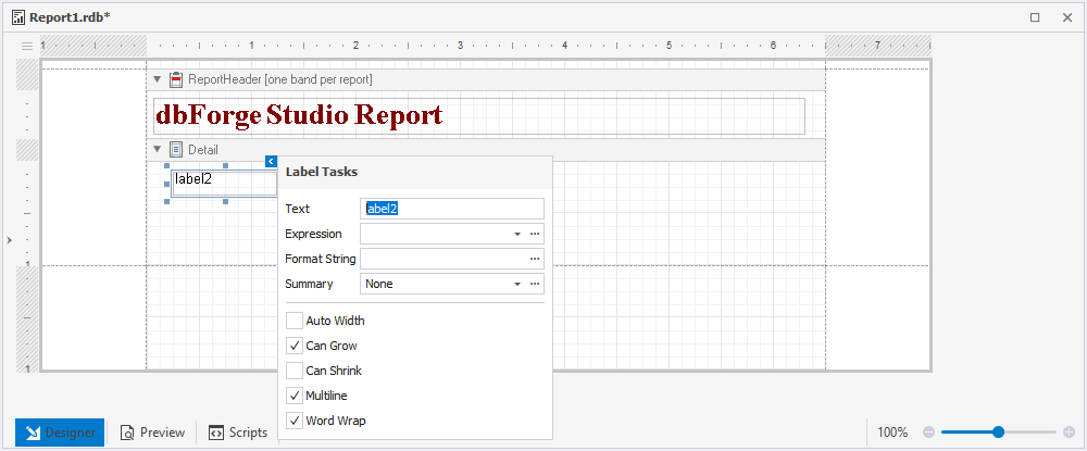
Label

The Label control is used to display descriptive text in a report.
By double-clicking the control, you can modify the text using the in-place editor. Furthermore, the smart tag menu can be utilized to execute the following operations on the control:
- Change the text of the control.
- In the Expression field, associate the control with data from a report’s data source.
- Modify the appearance of the control’s data using the Format String editor.
- Compute a summary for a group, report, or page with the help of the Summary editor.
- Resize the control to fit its content by selecting the Auto Width checkbox.
- Adjust the height of the control by selecting or clearing the Can Grow and Can Shrink checkboxes.
- Activate the multiline text or word wrap feature.
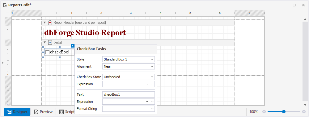
Check Box

The Check Box control lets you present checkboxes in a report.
To use the control, double-click it. You can use the smart tag menu to perform various operations on the control, such as:
- Modify the control’s appearance with the help of styles available in the Style drop-down list.
- Alter the alignment of the checkbox.
- Indicate the control’s state by selecting either Checked, Unchecked, or Indeterminate from the Check Box State drop-down list.
- Associate the control with data from the data source of a report in the Expression field.
- Change the control caption in the Text field.
- Utilize the Format String editor to format the control data.
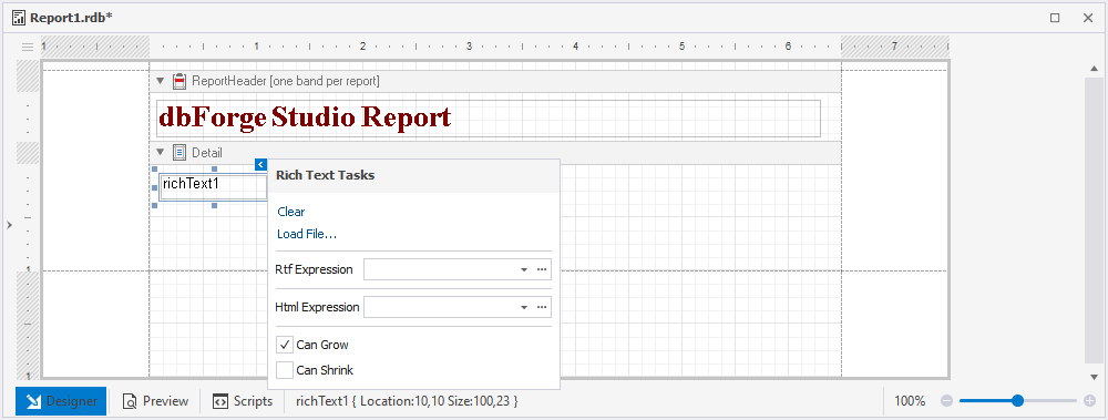
Rich Text

The Rich text control enables you to display formatted text in a report, allowing for more customization and visual appeal.
To modify the control caption in the in-place editor, just double-click the control. Additionally, you can use the smart tag menu to perform the following operations over the control:
- Upload data from .rtf, .docx, .html, and .htm files.
- Bind the control to data from a report’s data source containing RTF or HTML content using the Rtf Expression and Html Expression fields/editors respectively.
- Adjust the height of the control by selecting or clearing the Can Grow and Can Shrink checkboxes.
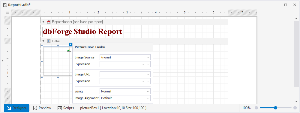
Picture Box

The Picture Box control allows you to insert images into a report for added context and visual representation.
With the smart tag menu of the control, you can:
- Upload the image to the control in the Image Source field.
- Associate the control with data from the data source of a report in the Expression field.
- Specify the path to the image in the Image URL field.
- Adjust the size of the image in the Sizing field.
- Manage the alignment of the image.
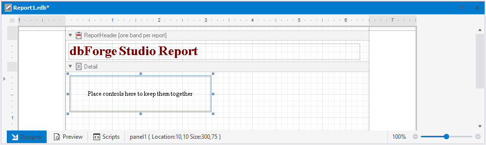
Panel

The Panel control provides an identifiable grouping for other controls.
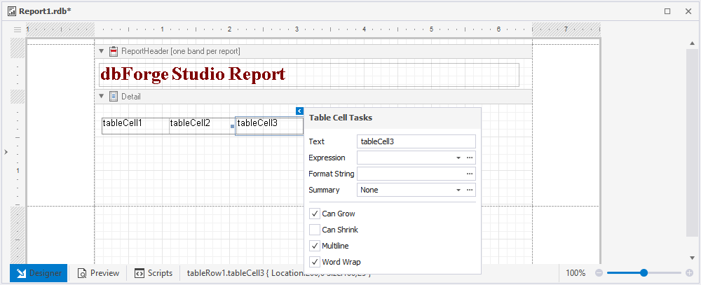
Table

The Table control lets format and display data in a tabular form.
You can double-click the control and modify the control text in the in-place editor. Furthermore, the smart tag menu allows you to carry out individual operations on each cell:
- Modify the text of the control.
- Associate the control with data from the data source of a report in the Expression field.
- Format control data with the help of the Format String editor.
- Compute a summary for a group, report, or page with the help of the Summary editor.
- Adjust the width of the control to its content by selecting the Auto Width checkbox.
- Enable the multiline text or word wrap.
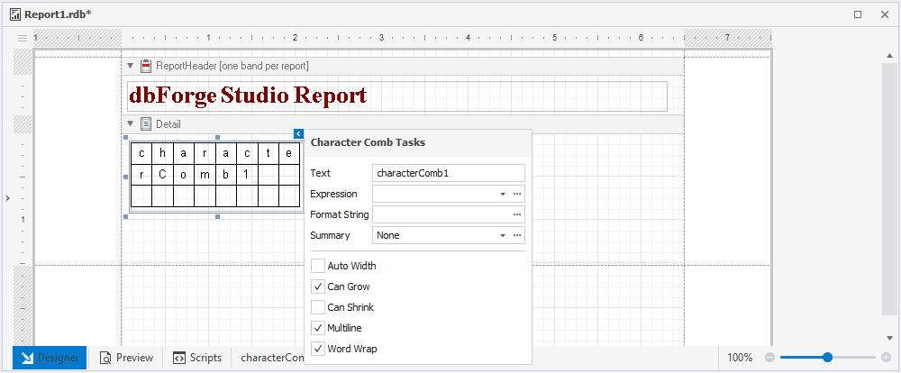
Character Comb
The Character Comb control allows you to split a string into individual cells, with each cell containing a single character.
You can double-click the control and modify the control text in the in-place editor or use the smart tag menu to perform the following operations over the control:
- Change the text of the control.
- Associate the control with data from the data source of a report in the Expression field.
- Adjust the height of the control by selecting or clearing the Can Grow and Can Shrink checkboxes.
- Format control data with the help of the Format String editor.
- Compute a summary for a group, report, or page with the help of the Summary editor.
- Adjust the width of the control to its content by selecting the Auto Width checkbox.
- Enable the multiline text or word wrap.
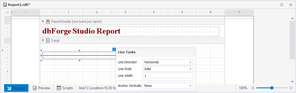
Line

The Line control is used to organize report sections by visually separating them with lines.
The smart tag menu enables you to personalize the line’s visual aspects, including drawing horizontal, vertical, or diagonal lines, choosing from solid, dashed, dotted, or mixed line styles, and setting the line width and vertical anchoring style.
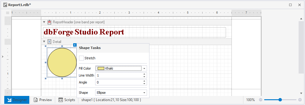
Shape

The Shape control allows adding simple graphic elements, such as arrows or circles, to a report.
To customize the appearance of a graphic element, you can use the smart tag menu:
- Stretch a shape in case its size changes by selecting the Stretch checkbox.
- Specify the background color.
- Set the outline width.
- Indicate the degree of rotation for the graphic element.
- Select the shape of the graphic element.
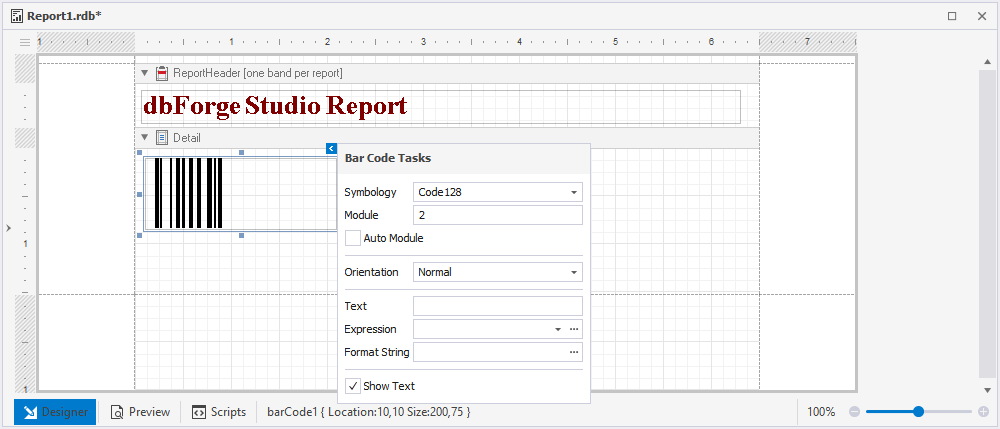
Bar Code
The Bar Code control permits you to display barcodes and generate them based on specified data.
The smart tag menu allows setting barcode properties:
- Select a barcode type from the Symbology drop-down list.
- Enter a specific barcode width value in the Module field.
- Select the Auto Module box to have the barcode width set automatically.
- Specify the barcode orientation.
- Insert the barcode text.
- Associate the control with data from the data source of a report in the Expression field.
- Use the Format String editor to format control data.
- Select the Show Text checkbox to show the barcode text.
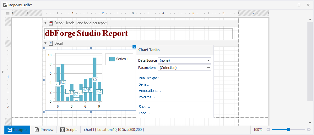
Chart

The Chart control lets you present report data as a diagram, providing a visual representation of data relationships and trends.
Dragging the Chart control onto the band will open the Chart Designer, allowing you to add a chart and adjust its configurations.
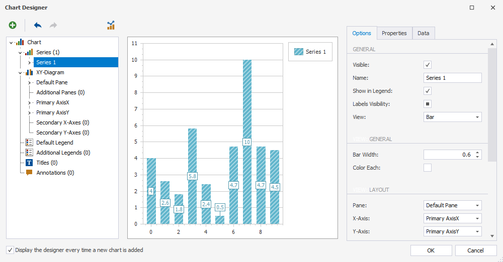
Once the chart has been added, you can use the smart tag menu to carry out the following actions on the control:
- Connect a chart to data by using the Data Source field.
- Open Chart Designer to modify the chart settings. For this, click Run Designer.
- Customize a series by clicking Series.
- Click Annotations to add an annotation and adjust its settings.
- Customize the palettes by clicking Palettes.
- Export a chart to an .xml file.
- Load a chart as an .xml file.
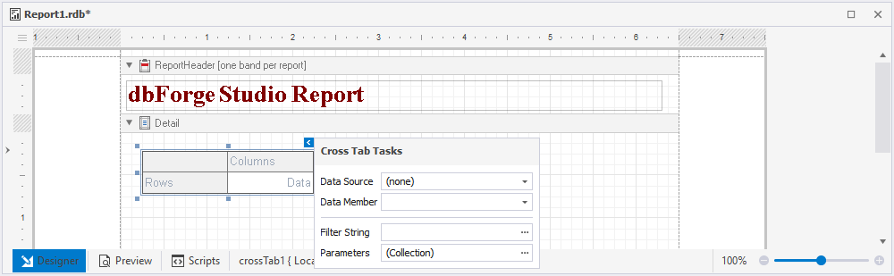
Cross Tab

The Cross Tab control helps display and edit pivot tables, allowing for a more flexible and dynamic approach to data analysis.
Note
If the Cross Tab control is bound to data, set the Data Source option in the report smart tag to (none) to display it correctly.
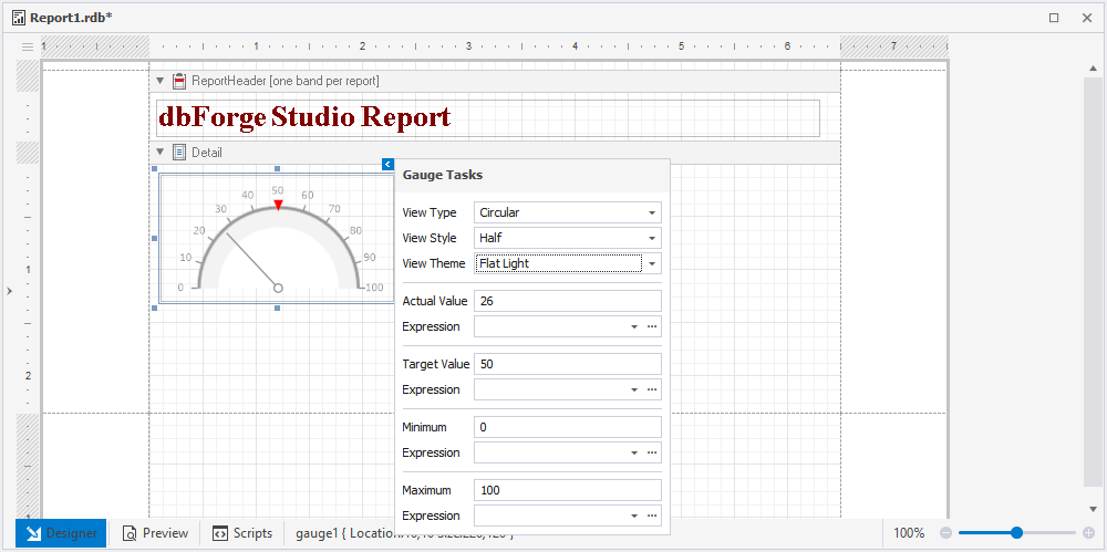
Gauge

The Gauge control enables you to add graphical gauges to your report, providing a clear and concise visual representation of data trends.
You can use the smart tag menu to customize the gauge:
- Specify a view type: linear or circular.
- Define the view style for a linear gauge as either horizontal or vertical, and for a circular gauge, select from full, half, quarter left, quarter right, or three fourths.
- Specify a view theme: flat light or flat dark.
- Enter the values for both the actual and target to be shown on the gauge.
- Link the values to the data source in their respective Expression fields.
- Set the maximum and minimum values for a gauge.
Sparkline
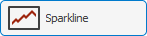
The Sparkline control provides you with the capability to display a compact chart, which is used to represent the data flow for every row in a report. This control can be used to quickly visualize data trends without taking up too much space.
By using the smart tag menu, you can carry out the following actions on the sparkline:
- Bind the control to data.
- Enter the name of the data member assigned to a sparkline.
- Select the data field that will be used to obtain the values.
- Customize the sparkline view: line, area, bar, or winloss.
PDF Content

The PDF Content control allows you to embed PDF content into a report for added context and reference.
You can use the smart tag menu to perform the following operations over the control:
- Import a .pdf file.
- Associate the control with data from the data source of a report in the Expression field.
- Specify a path to the .pdf file.
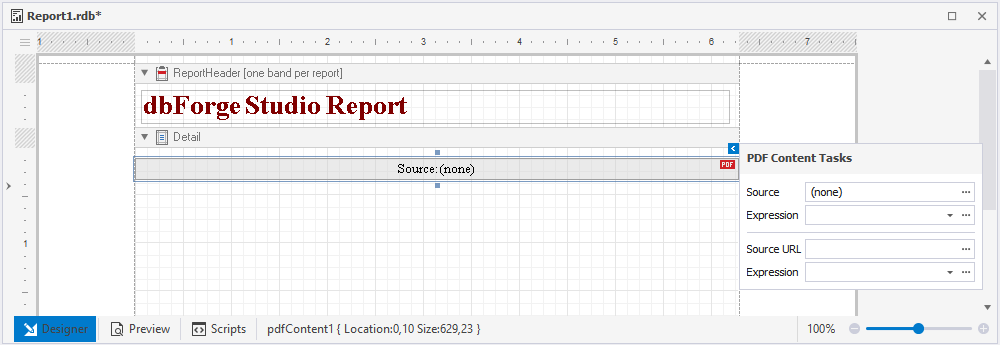
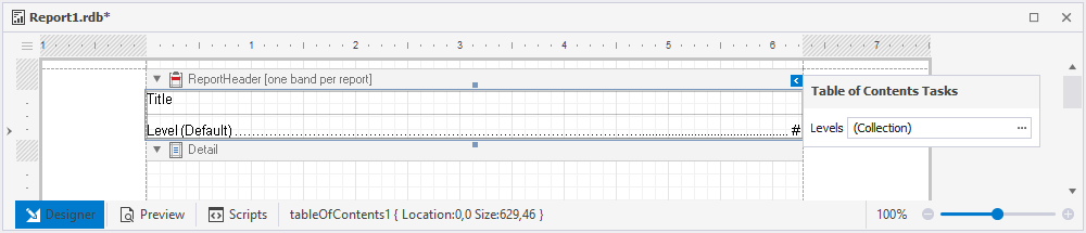
Table of Contents
The Table of Contents control lets create a table of contents in a report, providing easy navigation and reference for the reader.
To include the Table of Contents control, drag the item from the Toolbox pane to the ReportHeader band. Using the smart tag menu, you can add an additional level to the table of contents.
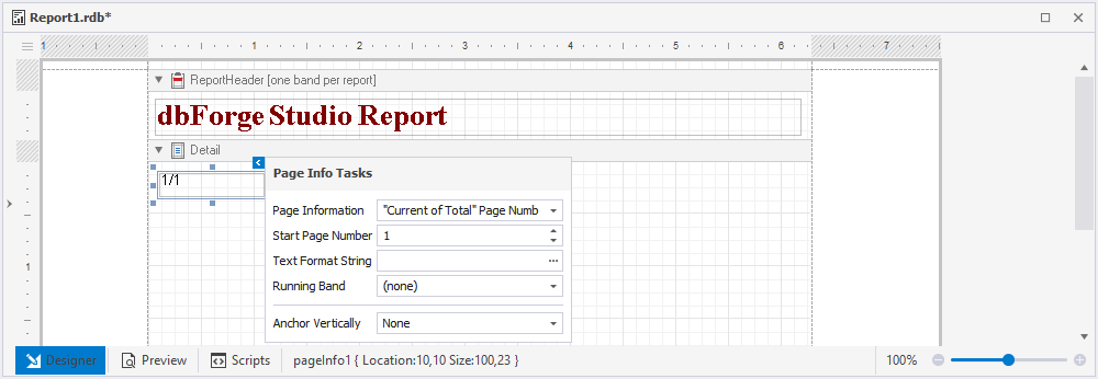
Page Info

The Page Info control permits to display extra information on your report’s pages, such as page numbers, dates, or other relevant data.
The smart tag menu allows you to perform such operations:
- Enable the presentation of supplementary information on report pages, including page numbers, dates, and other pertinent data.
- Specify a start page number.
- Utilize the Format String editor to format the control data.
- Set page numbers for the group, if it exists, in the Running Band field.
- Specify a type of vertical anchoring for the control.
Page Break

The Page Break control enables you to insert a page breakdown into your report, providing added organization and separation of report sections.
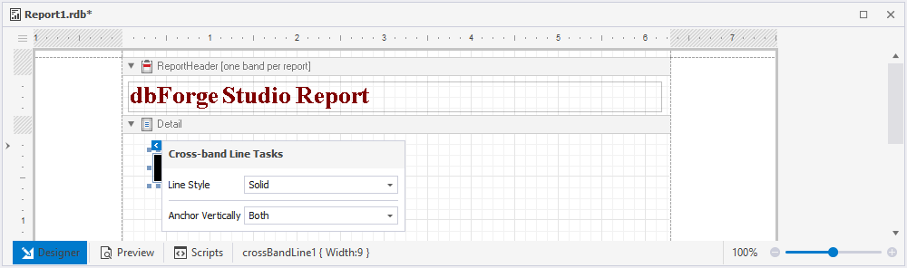
Cross-band Line
The Cross-band Line control allows you to draw lines on several channels and across the whole page, providing a flexible and customizable way to add visual elements to your report.
You can personalize the control’s style and choose a vertical anchoring type with the help of the smart tag menu.
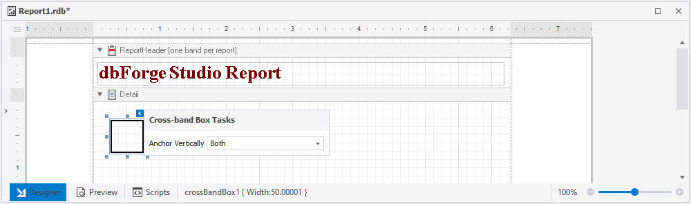
Cross-band Box
The Cross-band Box control lets draw rectangles across multiple channels and the entire page, delivering a versatile and adaptable method for incorporating visual components into your report.
You can use the smart tag menu to specify a type of vertical anchoring of the control.