Report controls
With the report controls delivered by dbForge Studio for PostgreSQL, users can facilitate the creation of reports using data stored in SQL Server databases. These controls offer a user-friendly graphical interface to create reports that incorporate tables, charts, graphs, and other data visualization tools.
To add a new control to the report, use either of the following options:
- Drag an item from the Toolbox pane to the report band.
- Use the Data Source window. When any data field is dragged to a report, a new appropriate report control is added and automatically bound to the specified data field.
Types of controls
There are the following report controls in dbForge Studio for PostgreSQL:
- Pointer
- Label
- Check Box
- Rich Text
- Picture Box
- Panel
- Character Comb
- Line
- Shape
- Barcode
- Chart
- Cross Tab
- Gauge
- Sparkline
- PDF Content
- PDF Signature
- Table of Contents
- Page Info
- Page Break
- Cross-band Line
- Cross-band Box
Pointer

The Pointer control allows you to customize the size, configuration, and other attributes of the current controls on a report worksheet using the available options.
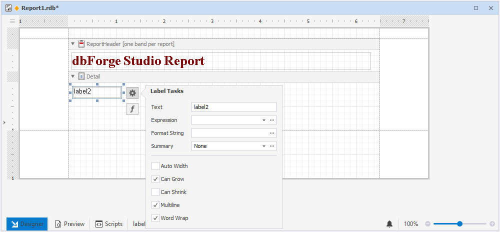
Label

The Label control allows you to present explanatory text in a report.
Double-clicking on the control allows you to modify the text using the in-place editor. Furthermore, you can perform different operations on the control by using the options available in the smart tag menu:
- Change the text of the control.
- Link the control to data from the report’s data source by specifying it in the Expression field.
- Modify the display format of the control’s data by using the Format String editor.
- Compute a summary for a group, report, or page with the help of the Summary editor.
- Resize the control to fit its content by selecting the Auto Width checkbox.
- Adjust the height of the control by selecting or clearing the Can Grow and Can Shrink checkboxes.
- Enable the multiline text or word wrap functionality.
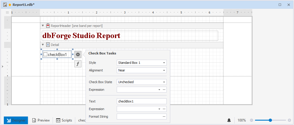
Check Box

The Check Box control permits you to show checkboxes in a report.
To utilize the control, double-click on it. You can access the smart tag menu to carry out diverse operations on the control, including:
- Modify the control’s appearance with the help of styles available in the Style drop-down list.
- Adjust the checkbox alignment.
- Indicate the control’s state by selecting either Checked, Unchecked, or Indeterminate from the Check Box State drop-down list.
- Associate the control with data from the data source of a report in the Expression field.
- Change the control caption in the Text field.
- Utilize the Format String editor to format the control data.
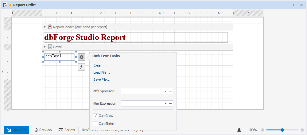
Rich Text

The Rich Text control lets display formatted text in a report, giving you more flexibility and enhancing its visual appeal.
To edit the control caption using the in-place editor, simply double-click on the control. Moreover, you can use the smart tag menu to execute the following operations on the control:
- Upload data from .rtf, .docx, .html, and .htm files.
- Bind the control to data from a report’s data source that includes RTF or HTML content by utilizing the Rtf Expression and Html Expression fields/editors, respectively.
- Adjust the height of the control by selecting or clearing the Can Grow and Can Shrink checkboxes.
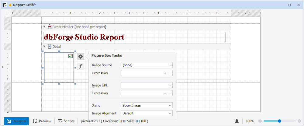
Picture Box
The Picture Box control allows you to include images in a report, offering more context and visual representation.
With the smart tag menu of the control, you can:
- Upload the image in the Image Source field.
- Associate the control with data from the data source of a report in the Expression field.
- Specify the path to the image in the Image URL field.
- Adjust the size of the image in the Sizing field.
- Manage the alignment of the image.
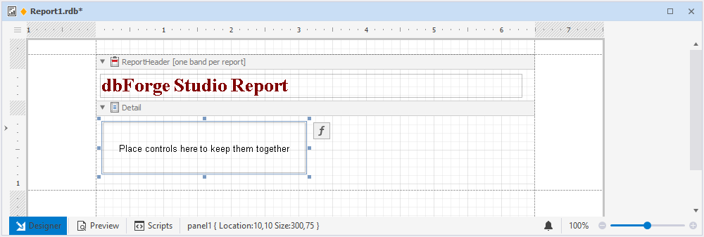
Panel

The Panel control provides an identifiable grouping for other controls.
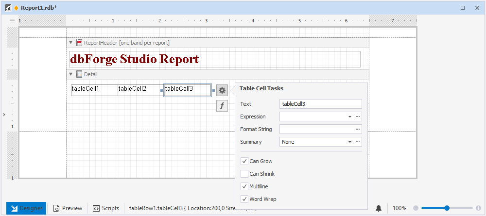
Table
The Table control lets format and display data in a tabular form.
You can modify the control text using the in-place editor by double-clicking on the control. Additionally, the smart tag menu enables you to perform specific operations on each cell:
- Edit the text of the control.
- Associate the control with data from the data source of a report in the Expression field.
- Format control data with the help of the Format String editor.
- Calculate a summary for a group, report, or page with the help of the Summary editor.
- Adjust the height of the control by selecting or clearing the Can Grow and Can Shrink checkboxes.
- Enable the multiline text or word wrap.
Character Comb
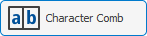
The Character Comb control allows you to split a string into individual cells, where each cell contains a single character.
To edit the control text, you can double-click on the control to open the in-place editor. Alternatively, you can utilize the smart tag menu to execute different actions on the control:
- Modify the text of the control.
- Link the control with data from the data source of a report in the Expression field.
- Adjust the height of the control by selecting or clearing the Can Grow and Can Shrink checkboxes.
- Format control data with the help of the Format String editor.
- Calculate a summary for a group, report, or page with the help of the Summary editor.
- Adjust the width of the control to its content by selecting the Auto Width checkbox.
- Enable the multiline text or word wrap.
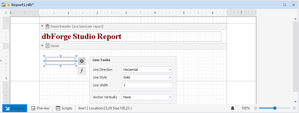
Line

The Line control permits you to visually distinguish report sections by using lines to separate them.
You can customize the appearance of lines using the smart tag menu. This includes options for drawing horizontal, vertical, or diagonal lines, selecting from a range of line styles such as solid, dashed, dotted, or mixed, and adjusting the line width and vertical anchoring style..
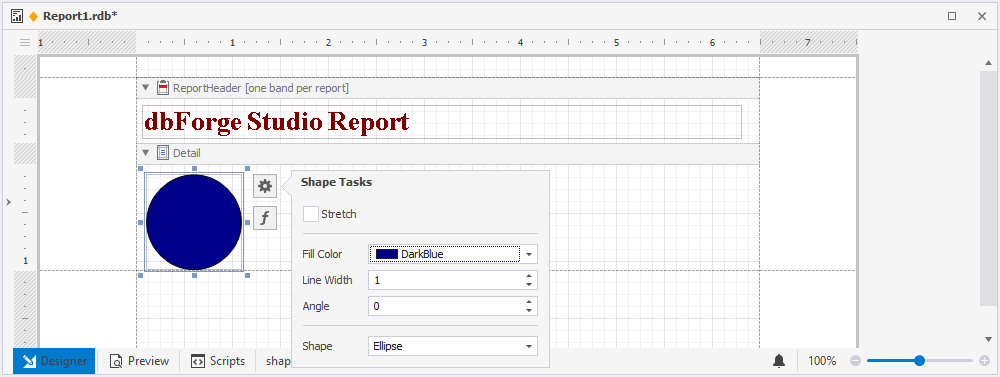
Shape

The Shape control allows you to add arrows or circles to a report.
If you want to personalize the appearance of a graphic element, the smart tag menu can be utilized:
- Stretch a shape in case its size changes by selecting the Stretch checkbox.
- Specify the background color.
- Set the outline width.
- Indicate the level of rotation for the graphical element.
- Select the shape of the graphic element.
Barcode
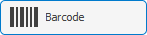
The Barcode control permits you to display and generate barcodes by using specified information.
With the smart tag menu, you can set barcode properties:
- Select a barcode type from the Symbology drop-down list.
- Enter a specific barcode width value in the Module field.
- Select the Auto Module box to have the barcode width set automatically.
- Specify the barcode orientation.
- Insert the barcode text.
- Associate the control with data from the data source of a report in the Expression field.
- Use the Format String editor to format control data.
- Select the Show Text checkbox to show the barcode text.
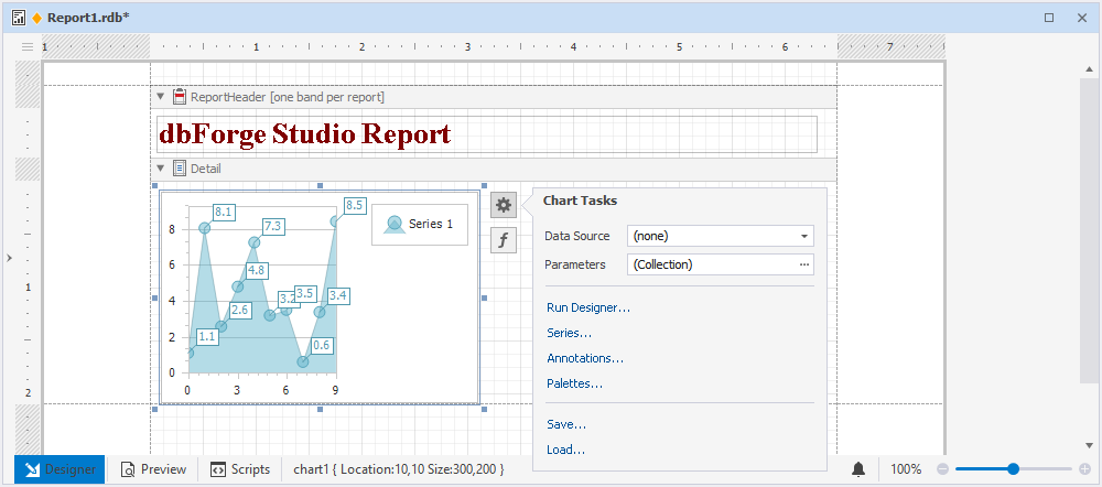
Chart

The Chart control lets you present report data in the form of a chart, giving a graphical depiction of the connections and patterns in the data.
When you drag the Chart control onto the band, the Chart Designer will open and you will be able to add a chart and adjust its configurations.
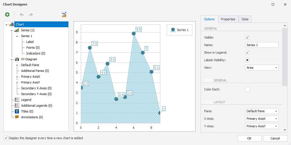
After you have added the chart, you can use the smart tag menu to perform the following actions on the control:
- Associate a chart with data by utilizing the Data Source field.
- Open Chart Designer to modify the chart settings. For this, click Run Designer.
- Customize a series by clicking Series.
- Add an annotation and adjust its settings with the help of Annotations.
- Customize the palettes by clicking Palettes.
- Save a chart as an .xml file.
- Upload a chart as an .xml file.
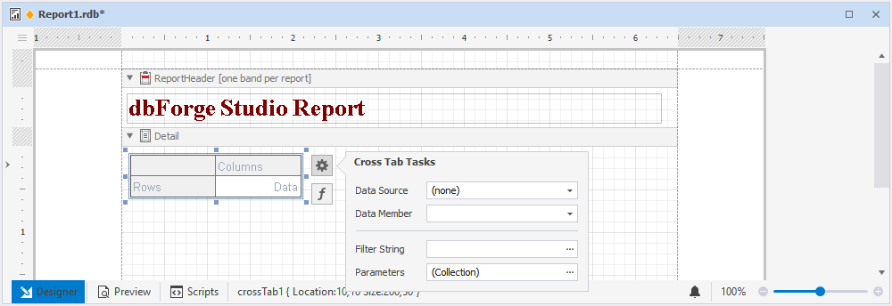
Cross Tab

The Cross Tab control allows display and edit pivot tables, allowing for a more flexible and dynamic approach to data analysis.
Note
If the Cross Tab control is bound to data, set the Data Source option in the report smart tag to (none) to display it correctly.
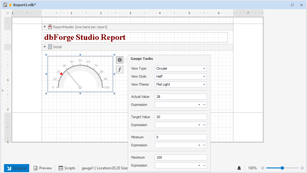
Gauge

The Gauge control enables you to incorporate graphical gauges into your report, which provide a simple and concise visual representation of data trends.
You can use the smart tag menu to customize the gauge:
- Select a view type: linear or circular.
- Define the view style for a linear gauge as either horizontal or vertical, and for a circular gauge, select from full, half, quarter left, quarter right, or three fourths.
- Specify a view theme: flat light or flat dark.
- Enter the values for both the actual and target to be shown on the gauge.
- Link the values to the data source in their respective Expression fields.
- Set the maximum and minimum values for a gauge.
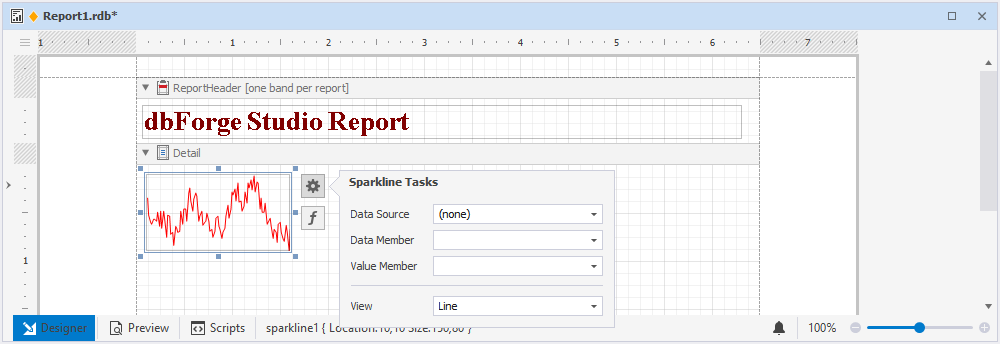
Sparkline
The Sparkline control offers the ability to display a condensed chart that represents the data progression for each row in a report. With this control, you can quickly visualize data trends without taking up too much space.
By using the smart tag menu, you can carry out the following actions on the sparkline:
- Link the control to data.
- Enter the name of the data member assigned to a sparkline.
- Select the data field for obtaining the values.
- Customize the sparkline view: line, area, bar, or winloss.
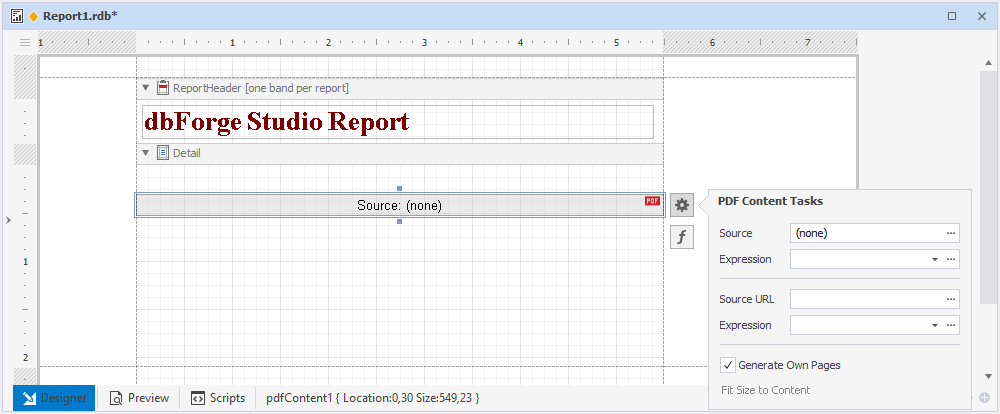
PDF Content
The PDF Content control allows you to insert PDF content into a report to provide additional context and reference.
You can use the smart tag menu to perform the following operations:
- Upload a .pdf file.
- Associate the control with data from the data source of a report in the Expression field.
- Specify a path to the .pdf file.
- Set the size for your PDF content by selecting Generate Own Pages.
PDF Signature
The PDF Signature control lets you add a visual signature to a report exported to PDF, providing an added layer of security and authenticity.
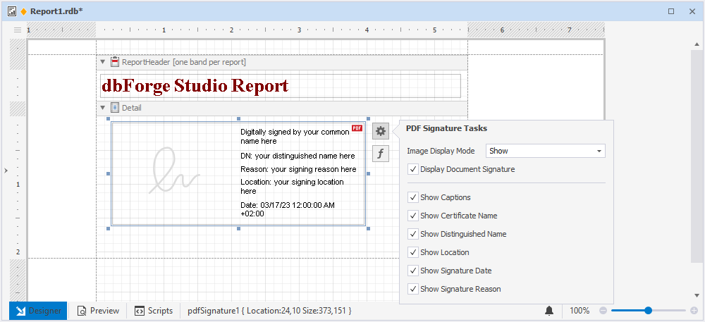
Table of Contents
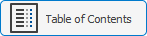
The Table of Contents control enables the creation of a table of contents for a report, providing easy navigation and reference points for the reader.
To include the Table of Contents control, drag the item from the Toolbox pane to the ReportHeader band. Using the smart tag menu, you can add an additional level to the table of contents.
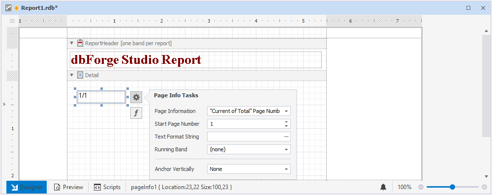
Page Info

The Page Info control permits the display of supplementary information on report pages, such as page numbers, dates, or other pertinent data.
With the smart tag menu, you can:
- Facilitate the display of additional details on pages within a report, encompassing page numbers, dates, and other relevant information.
- Specify a start page number.
- Utilize the Text Format String editor to format the control data.
- Set page numbers for the group, if it exists, in the Running Band field.
- Specify a type of vertical anchoring for the control.
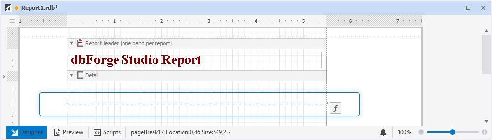
Page Break

The Page Break control permits you to insert a page breakdown into your report, providing added organization and separation of report sections.
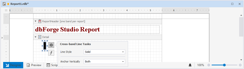
Cross-band Line
The Cross-band Line control allows you to draw lines on several channels and across the whole page, providing a flexible and customizable way to add visual elements to your report.
You can customize the control’s style and choose a vertical anchoring type with the help of the smart tag menu.
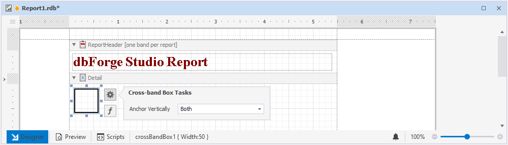
Cross-band Box
The Cross-band Box control enables you to draw rectangles across multiple channels and the entire page, delivering a versatile and adaptable method for incorporating visual components into your report.
You can use the smart tag menu to specify a type of vertical anchoring of the control.