Creating a Chart in Pivot Table
You can generate and view pivot data as a chart that helps you visualize data dependencies and compare them.
To create a chart for the pivot table
Note
As an example, we will use the pivot table created in Creating a pivot table.
1. On the Pivot Table document view toolbar, click ![]() Show Chart to open the Chart view of the pivot table document.
Show Chart to open the Chart view of the pivot table document.
2. In the Pivot Table document view, select the data to be displayed on the chart. To do this, press CTRL and click the required cells of the pivot table:

3. In the Chart view, customize the diagram.
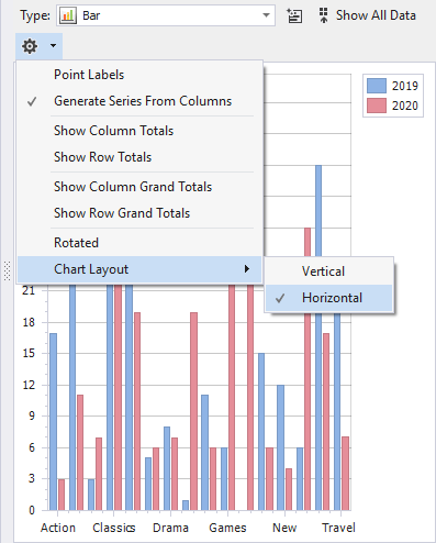
- Click
 Settings to configure what data should be displayed and how.
-
Click Show All Data to display all information on the chart
-
Click
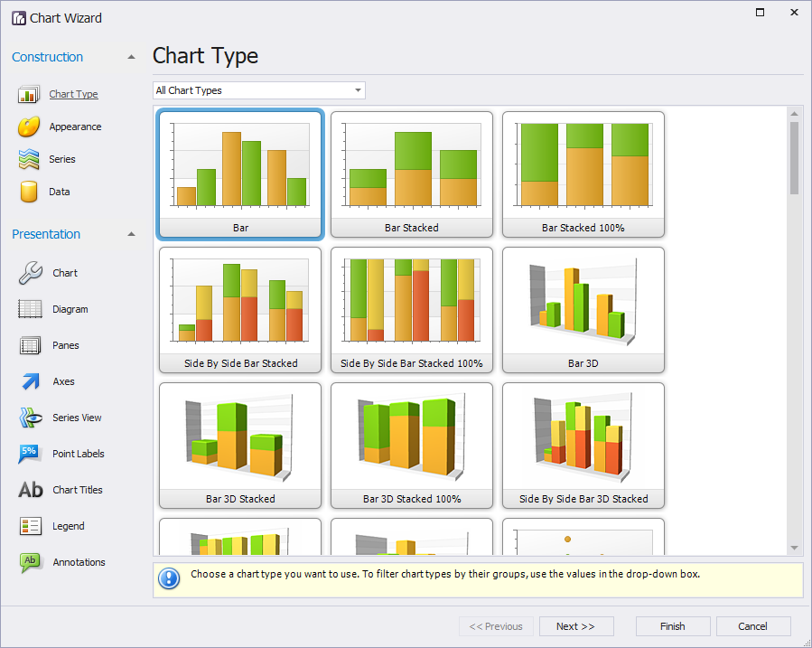
 Chart Designer to adjust construction and presentation of the chart.